Like the dashboard of a car, dashboards produced using HomelessData.com provide a quick view into what is happening “under the hood” within a region. HUD System Performance Measures (SPMs) lack context when looked at in isolation. SPM dashboards support both peer to peer benchmarking, and year over year trend analysis, to provide that context. Still, without the ability to measure performance at a project level, decision-makers cannot discern which providers are helping, and which are hindering, the system.
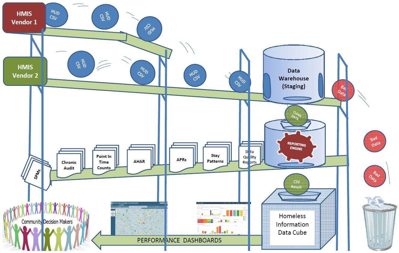
The image below illustrates the process we use to automatically refresh project-performance dashboards. using results culled from existing HUD reports, to fill that gap.
 The data visualization workbooks, which consume results from “regional data cubes” contain pre-built filters to enable end users to “slice and dice” results without the risk of coding errors. This makes it easy for decision makers to measure the progress of ending homelessness for target populations such as the chronically homeless, young adults, and veterans.
Since the cubes contain aggregate results, and not client-level data, this means free versions of Tableau Public can be used to produce dashboards such as the one shown below.
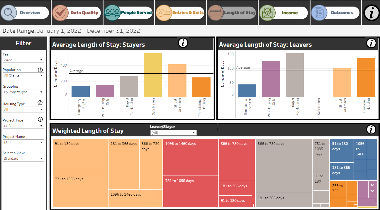 An example of a project-performance dashboard that was produced using this approach can be found here. This same technology can be used to support NOFA ranking, determine if there are disparities in outcomes between racial categories, monitor data quality, and to guide policy-making decisions.